Friday 18 January 2008

2 improved


i thought about the 2-poster again, and i think like this it's even better. it's not that obvious (still very obvious, but not so much), and you have think about a little longer. aditionally it looks better regarding the shape i think.

typoposter


these are two posters about typography i made for an optional assignment. there were different keywords we could choose to make posters for, i chose "silence" ("stilte" in dutch) and "2".
i chose to make the like contrary of silence, and then placed the word in all that rummely text to mark the place where the silence is. about that.
for the 2-poster i liked that you only see so few of the letter itself but you stil know emmediately what it's about. simple.
i think they look best printed large on that nature-white paper. black prints on broken white always look great.

Jazzz


this was for the same assignment as the dialogue, further downwards on this site. we got the sound (which i had to extend x3 to fit to the movie) and should make something for it. usually we should have used aftereffects for it, but i did it with flash. it has some nicer functions for directly drawing in flash with a pen tablet, and because of it being vector based, previewing and exporting the file works a lot faster than in afx. but even with the program working faster, it was whole lot of drawing and keyframing. i'm quite satisfied with the result. jazzy.

Tuesday 15 January 2008

Leiber & Stoller


making this one was fun. i completely animated the movie in flash, and if you know flash, you will know that that's a bunch of work then. but anyways, i had my fun doing it, and i guess you can also see that in the movie. the assignment was pretty free, we should make an animated moodboard for "leiber & stoller", and what or who that is, we could think ourselfs. for me they're the new special force from the public health department.
i finally managed to get the sound sticking to the film aswell, by using the "stream" function in flash. when i first tried that the quality went down, but that was just because i was exporting it the wrong way. now it is absolutely finished. i'm so happy.

Sunday 13 January 2008

medium format camera


i've bought this beautiful camera on the internet (the camera on the picture isn't actually mine, but it's the same type). it has one of these viewfinders with a focussing screen you look in from above, and you can easily adjust exposure time and aperture, and it has a self-timer, i have a flash for it you can mount it on a tripod, it makes nice 6x6cm negatives and it has everything you would want from a medium format camera. ok, watching other medium cameras it probably isn't the best, but anyways it's a good access to this kind of photography and is good to learn how to handle these cameras. and additionally, i got it for 21€+7€ dispatch in good condition! what a great deal, the first time i got something useful on ebay!

new computer!


about my computer. the bad news is i've given up hope of repairing it. it would be too expensive, and it is too old for that. the good news is, i've already ordered a new one, the one you see above from zepto.com. it's a really good one and i finaced it with some christmas-money, some saved money. i thought aout buyin a mac, but this one has a lot more power and still is cheaper than medium macbook. i think this is gonna be good. the other bad news is, that it probably not be delivered before the werkschau. not good. i was so looking forward to working at home again and being just as productive as with my good ol' laptop... i'll have to work in the aki then.
update: it's here and it's great! hello productivity!

zoom with motion-blur


i made this for fun after having discovered sven's amusing secrets. it really was in the picture and i found it only coincidentally. click anywhere in the picture to find out what i mean!
i had to lough out loud after seeing what's in the picture if you zoom in a bit. i think it's great what you can discover in pictures from a 10 million pixel camera, it's really funny sometimes.

camouflage ver.0.1


a moodboard for a new ficticious fashion label by vivienne westwood. i first listed up what it's all about and then ended with a short video giving the impression of which direction to go for the label identity. it's still a it sketchy and i'll have to change a bit.

dialogue final


i reworked the dialogue. looks not that different compared with the first one, but i thing the typo ist better and i also deleted some other bugging stuff. looks like not much work already having that first one, but it was. i had to place every single word new after changing the typo and make it reveal again. that was stupid. but now it's finished and i am happy with it. yup.
uploading it with blogger didn't work so i put it on youtube.

toilet portraits


as the name says, these are portraits of my toilet. simple. it was a mixture-assignement of the packshots we did very early this year and the portrait assignment i'd say. the photos should be nice somehow, and special in a way. additionally you should show your toilet as you see it. i'm really happy what the photos look like, though it was a real mess in the bathroom after that session. there is not too much photoshopping in them, they already looked pretty good, right out the camera.
see what i did and make your thoughts...

masks


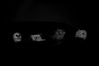
this was a rather difficult one. we should pic the photo from the last assignment the "depth" one, and make another one, creating a series with the first. not that bad you could think, but the new one should together with the old one give it a completely new meaning, but it should still remind you of the first. and if possble the new meaning should go in the oposite direction of the first.
with these masks, i wanted to say, that there are no real differences in the minds of different peole, like you can interprete from the older photo. the new one should tell you, that everyone is the same in the end, and that everything else is just acted.
technically i made it like the one before to have it look the same.

depth


after the assignment about "colour and space", we got another photographical assignment, this time about "depth". our teacher first of all told us two stories, one about spacial depth and one about the depth of the human mind. so, we were able to go in all directions by soluting the problem of illustrating depth. i liked the idea about the depth of mind, and wanted to show that only through small differences in the mind, a human being can develope in every direction. only by a tiny split, two completely persons can emerge from the same mind.
i also want to underline, that the picture is 100% pure photo, WITHOUT ANY PHOTOSHOPPING. i made it by unsing 30 secs exposure time and running around like crazy. stefan was a great help by flashing me with a torch everytime i was in position.

colour and space


for this assignment we met our teacher near the area of enschede, where the fireworks-explosion took place. many has changed since that, and a whole lot of new buildings with very up-to-date architecture has been built there. that is why very opposite styles of buildngs and people meet there, on the one hand the older and classically dutch houses, that have came through the accident unharmed and very new houses and constitutions. we should now take a series of 36 black&white photos there, illustrating colour (aswell "diversity") and space (meaning range). i tried to make that,completely documenting the progression of one street, from near the center along the area of the explosion till far out. i made a nice flash file for better presentation on the internet. see yourself what it became.
UPDATE: it seems like this swf doesn't work on the latest version of firefox. i have no idea why. if you can't see it but want to (it really does pay out) you should try another browser.

rozentheater


this assignment was fun. in amsterdam there is nice, little theater, probably more than just one, but one of them is called the "rozentheater". it is placed in a nice, little theater building, which the dutch state did not consider to be that nice, because they thought it was "dilapidated". so it had to be renovated and a large poster should be placed on it's front for the time this should take. we should now imagine we should take that photo, which also should explain the situatiuon a bit. that's what i did.

portrait


i took this photo for an assignment in which we should make a portrait of the one fellow student who was sitting right from us in the lesson that day. i sat next to anna. the portrait should not explicit show the person physically, moreover who it is. a sporty girl who likes shoes as you hopefully see.

this was a photo i originally took for myself, just for fun so to say. moreover it's part of a serie, but it's not yet finished. anyways, our teachers pleased us to make a selection of photos we considered to be best of our work to create make a presentation for the "open dag" of our academy from the selections of all students. i just put it in my selection, thinking my other photos would be better most probable. but this one chosen to be the only one printed from my selection, and that in the largest size printable at our academy (about 1,20m wide). looks great that size if you ask me.

DAna nanaA Batman!


yes, we really had a "genuine" bat in our house. flew in the bathroom somehow and i cought it and started a photo-session with it. nuts.

Saturday 12 January 2008

some fotos inbetween

these are some older fotos i didn't make for assignments or stuff, but yet wanted to show.


in my parent's garden, comes around pretty often hat little fella.


some snapshot.


my housemate. starring.


stefan was organizing his photos and i just took this one.


from a book about ww2.

treebutton


this is a button, made in flash. i got the idea for it, when i learned how buttons in flash actually work, and that you can combine them with animations aswell. it's rather old, but i like it and wanted to upload it here, i don't know yet if i'm gonna use it for something.
it has a mouseover-effect and loops after some clicking, go ahead and try!